
OpenGridWorks: The Impressive Interactive Map of the World's Electrical Grid
Discover how energy is generated, transmitted, and consumed globally. This platform is key to understanding the energy transition.
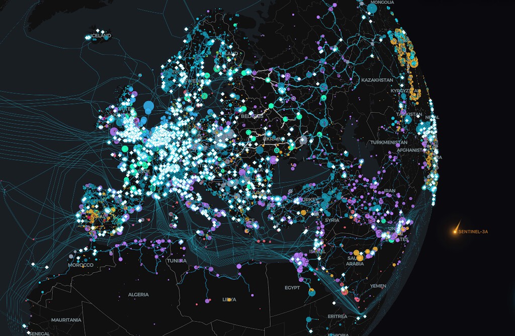
OpenGridWorks, an interactive map of the world's electrical infrastructure, is now available to the global community. This platform offers a detailed view of how energy is generated, transmitted, and consumed worldwide. It integrates data from OpenStreetMap and Global Energy Monitor, among other reliable sources. Its launch is crucial for understanding the grid's complexity and the ongoing evolution of the energy transition.
The electrical grid stands as one of the most complex and essential infrastructures in our modern world. For most people, its operation simply means flipping a switch or plugging in a device. However, behind this simplicity lies a global system undergoing constant transformation. The shift towards renewable energy and the rise of data centers are redefining its uses and structure.
OpenGridWorks functions as a web-based geospatial visualization platform for electrical infrastructure. Its data primarily comes from OpenStreetMap, the world's largest collaborative and open geographic database. A global community of volunteers and experts maintains this database, ensuring worldwide coverage and constant updates. Additionally, it incorporates information from Global Energy Monitor and the U.S. Energy Information Administration, among other specialized sources.
OpenGridWorks aims to clearly and interactively display where electricity is generated, how it travels through the grid, and where consumption is concentrated. The platform allows users to activate and deactivate various information layers. It is important to manage these options carefully, as activating all layers simultaneously might create a visual "jumble." We recommend zooming in on the map to explore finer details.
OpenGridWorks democratizes access to essential data for the global energy future.
As you zoom in and explore the map, you will observe crucial information. The platform visualizes various key elements of the electrical grid:
- Generation technologies appear as colored bubbles, indicating their type and installed capacity. For instance, blue represents hydroelectric power, and yellow signifies solar.
- Transmission lines are drawn with a thickness that reflects their voltage, ranging from 100 kV up to 765 kV.
- Substations are shown as nodes where these lines converge, serving as key distribution points.
- Data centers are identified as white rhombuses, highlighting their role as intensive consumption points.
- Rights-of-Way (ROW) appear as shaded areas surrounding facilities and lines.
Keep reading online — scan the code
https://go.tricuatro.com/uai2F
© tricuatro.com
Related articles

MIT Chip Converts Invisible Infrared Light into Crucial Data
MIT researchers developed an innovative chip detecting methane and propane using mid-infrared light, with potential for millions of pixels and optical computing.

Tesla Launches Electric Cybertruck Replica for Kids in the US
Tesla introduces its scaled-down Cybertruck for children aged 6 to 12, an electric vehicle priced at USD 1,500, currently exclusive to the US market.

SpaceX Scrubs Starship Test Flight in South Texas
Computer systems detected an anomaly during the Super Heavy booster's engine startup sequence, forcing the mission's abort.
Latest news
View all
Assassin's Creed Black Flag Resynced Smashes 3 Million Sales, New Game Plus Announced
Ubisoft's successful re-release of the pirate classic continues to break records, confirming one of the most requested features from the gaming community.

TikTok tests AI tool to protect creators from deepfakes
The video platform is rolling out an opt-in feature allowing users to verify their identity and report unauthorized AI-generated likenesses.

The Batman II Delayed to 2028, New Teaser Freezes Us with Excitement
Warner Bros. Pictures confirmed another delay for 'The Batman' sequel, pushing its release to early 2028, but offset the wait with an intriguing, icy first look.
Comments (0)
No comments yet. Be the first!
Only registered readers can comment.