
Google Completely Revamps Gmail, Drive, and Docs with New Design
The company introduces a new visual identity for its productivity suite, unifying the experience and enhancing AI integration.

Prepare for a radical change in how you interact with your favorite productivity tools. Google has launched a complete overhaul of the icons and interface for key applications like Gmail, Drive, Docs, Sheets, and Calendar. This redesign, already rolling out to business accounts and beta program participants, aims to unify the visual identity of the entire suite under a modern and coherent language.
Google's strategy focuses on creating a more homogeneous and recognizable user experience. The iconic colors of each application, such as Gmail's red, Docs' blue, Sheets' green, and Calendar's yellow, are retained but now feature softer gradients and a fusion of tones that adds richer chromatic depth. This visual evolution aligns perfectly with the principles of Material You, Google's design language that prioritizes personalization, chromatic harmony, and adaptability to different screen sizes.
This ambitious redesign goes beyond just icons, introducing significant functional changes. The interface becomes more intuitive and proactive, reflecting the deep integration of artificial intelligence into everyday tasks. The Gemini button, previously a floating sidebar, now occupies a central position on the main toolbar, serving as the default command manager. Imagine interacting with your documents and spreadsheets in a completely new, AI-assisted way!
The changes are notable. Drive's traditional triangle transforms into a crystalline structure with Gemini's core at its center, while the Sheets icon abandons the classic two-dimensional grid for a dynamic three-dimensional representation. These adjustments aim not only to improve legibility and app identification but also to evoke a sense of processing and automation, key characteristics of modern computing.
The new design reflects a clear intention: to facilitate the identification of each application and improve the legibility of icons, both on mobile devices and desktops.
The adoption of the new Material You visual language is fundamental to this transformation. Google wants its applications to feel more personal and adaptable, allowing icons and interfaces to dynamically change shape and color. This is based on AI predictions of user actions, derived from recent usage patterns. It's a commitment to an experience where users never feel alone facing a task, but rather in constant co-creation with artificial intelligence.
The implementation of these changes is being carried out in phases. While business accounts and beta users are already enjoying the new aesthetic, it's estimated that all free personal Gmail accounts and devices with iOS and Android will receive the update over the next month. It's important to note that there will be no option to revert to the old icons, as the update is applied at the server level across the entire Google system. Even if advanced Gemini features are disabled, the new logos and visual architecture will remain active, marking a before and after for Google's productivity suite.
This visual and functional leap represents a definitive break from traditional office computing. Google is investing in an experience where every document or spreadsheet becomes a space for intelligent collaboration, reinforcing its suite's identity as a truly advanced and future-ready tool.
Article topics
Related articles

Windows Drops NTLM: Microsoft Boosts Security with Kerberos
Microsoft is taking a crucial step to bolster security in Windows 11, announcing the deprecation of NTLM, its oldest authentication protocol, in favor of Kerberos.
Google Launches Gemma 4 12B: Local AI for Your Laptop with 16GB RAM
Google's new artificial intelligence model aims to democratize access to generative AI, allowing it to run on average consumer computers.

Nvidia Challenges Intel and AMD with RTX Spark Superchip for PCs
Nvidia introduced RTX Spark, a processor promising to bring advanced artificial intelligence directly to your PC, without cloud dependence, and boost gaming to unprecedented levels on conventional machines.
Latest news
View all
Stuntman Hollywood: Returns After 19 Years to PS5, Xbox Series, and PC
The iconic action and vehicular stunt franchise makes its comeback courtesy of Saber Interactive, promising a dose of nostalgia and adrenaline for the new generation.
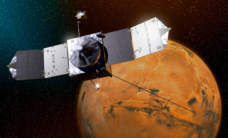
NASA's Maven Mars Orbiter Declared Out of Service After Six Months of Silence
Following an anomaly that disrupted its orbit and depleted its batteries, the Maven spacecraft, vital for understanding Mars' atmosphere, has ended its active mission. Its scientific data remains an invaluable legacy.

NASA Reveals New Path for Earth's Essential Life Elements
A recent study, published in Science Advances, uncovers how early Earth may have received phosphorus and nitrogen, highlighting Jupiter's critical role.
Comments (0)
No comments yet. Be the first!
Leave a comment